Company
Medly Pharmacy
Duration
8 months
Role
Product design, UX research
Team
Self, PM, UX researcher, UX writer, eng. team
Background
The app
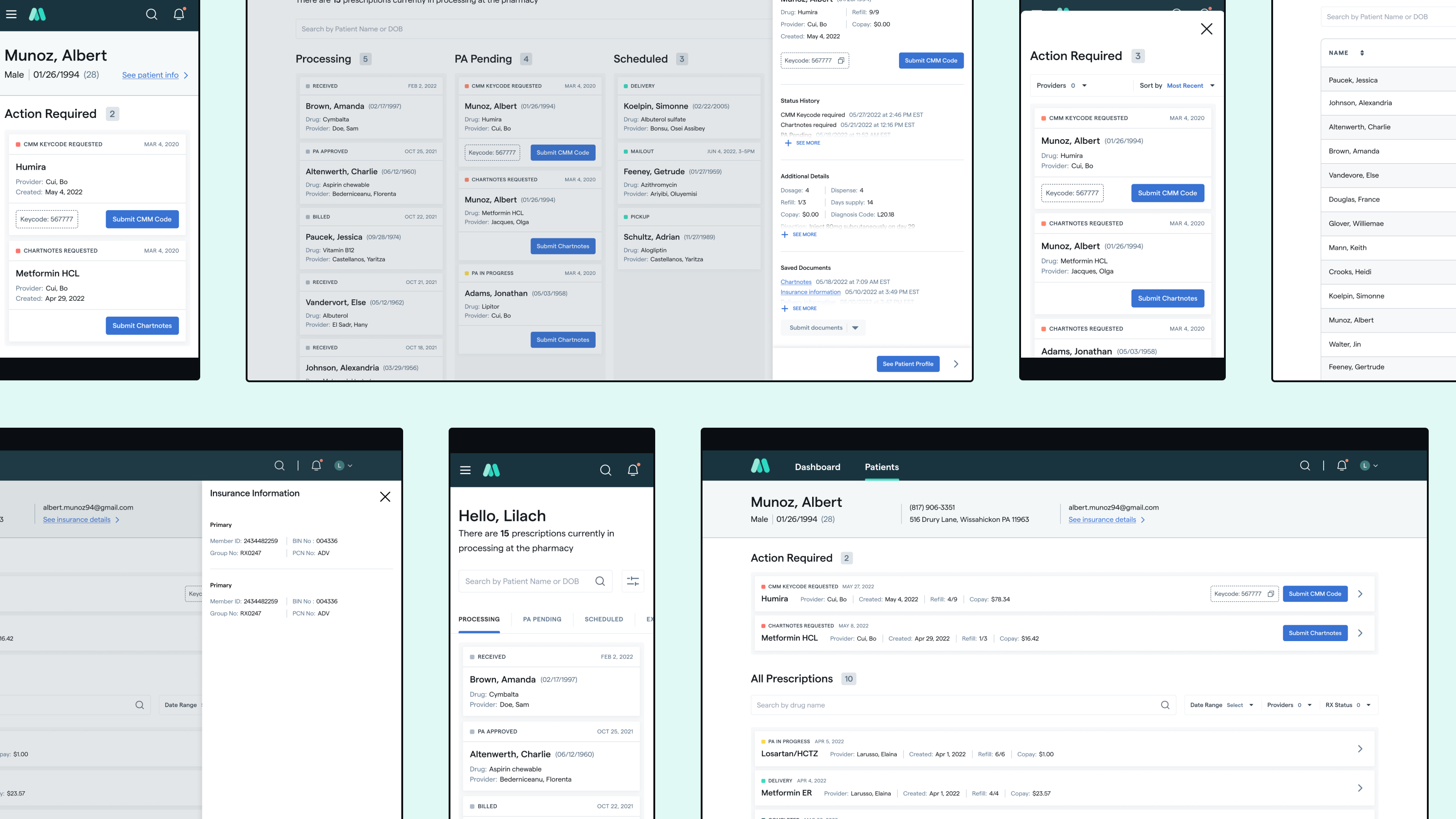
Medly 360 is an app used by providers and office staff in order to access and track patient prescriptions they send through Medly.
This data on M360 is also accessible via manually reaching out to the office’s Medly account managers, and many prefer this method due to the app’s data inaccuracy, latency, and general clunkiness.
The role
As the sole product designer for this product, I was able to partake in many of the general steps of the project such as generative research, prototyping, user testing, stakeholder management, and of course high fidelity designing.
Meeting doctors where they are
Generative research
Our UX researcher, PM, and myself collaborated on a script to determine the general workflow and day-to-day tasks of different providers.
Through synthesizing the results of these research sessions, we determined several key points:
- Providers all use different processes for tracking their patients’ medications, some on paper and others via spreadsheet
- Doctors’ offices are busy nearly all the time, and have to juggle many disparate software programs and websites
- Providers prefer to own the interactions with their patients and be the ones to communicate medication or treatment updates
Developing guiding principles
I determined 3 key north star points to keep the project focused and prevent too much deviation throughout the process:
A tool for everyone
- Design that accommodates both “power users” while being friendly towards new users or ones who may only access MC on an as-needed basis
- How can we create a smooth and friendly-yet-professional experience to encourage provider offices to continue (and hopefully increase) usage of MC
Substance over style
- Providing a quick, accurate, and relevant experience is more important than making something impressive/flashy, or stripping back too many elements for the sake of aesthetic minimalism
One part of a whole
- Acknowledge that our users are dealing with complex systems of which we are only a small part
- Focus on affecting and improving the areas we /can/ control
Seeking functional and visual inspiration
Adjacent products
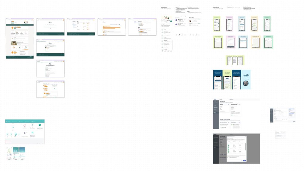
The first and most easily comparable apps and websites are those in the healthcare space which center around prescription tracking or management, and preferably ones with mobile counterparts or responsive designs.
I observed the layouts and information architecture of Alto, One Medical, and Fitbit.
Unconventional yet functional sources
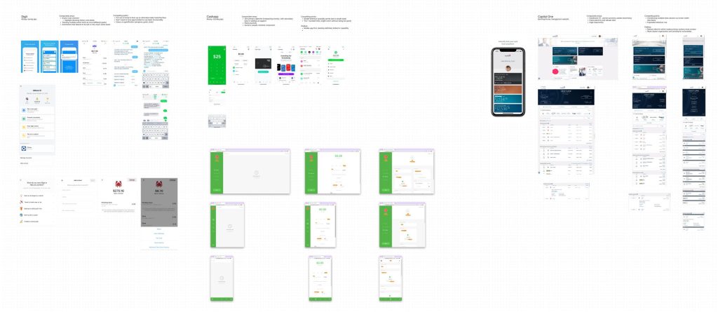
Another reference point I chose was personal finance apps and websites such as CashApp, Capital One, Bank of America, and Digit. All of them feature tracking one type of data (monetary transactions) which is often timestamped and contains secondary data such as vendor or purchase type.
Visual aspirations
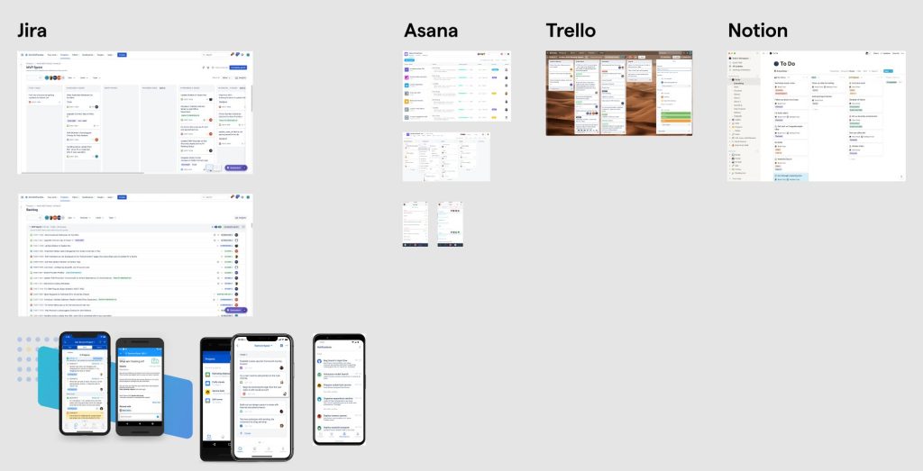
The dashboard is the homepage of M360 and the one which providers frequent, so I next looked to sites with tables or trackers and how they balanced colors, information architecture, and the flow of data. These included Jira, Notion, and Asana.
Data-first design
Exploring building blocks
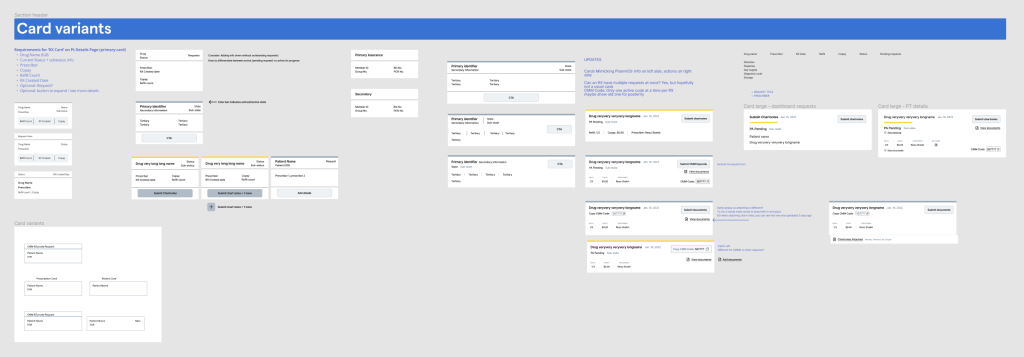
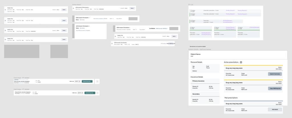
Taking stock of the then-current app’s data, I laid out all the data models and how they related to one another. The primary information was a patient’s prescription, so I explored how to lay out this data on the level of an individual prescription, all of a patient’s prescriptions, and all the prescriptions within a doctor’s office. Of course, mobile and responsive compatibility was a necessary consideration.
Reconsidering flow
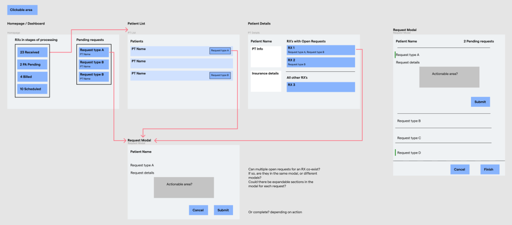
At the same time, I considered a user’s journey through the app and their primary purposes for visiting: uploading information relating to prior authorizations. Coupled with the prescription-centric components above, I wanted to better highlight the important pieces of information in places that were easy to understand and clear to reach.
Merging internal and B2C aesthetics
At the same time, I considered a user’s journey through the app and their primary purposes for visiting: uploading information relating to prior authorizations. Coupled with the prescription-centric components above, I wanted to better highlight the important pieces of information in places that were easy to understand and clear to reach.
Validating hypotheses
Mid-fidelity prototyping
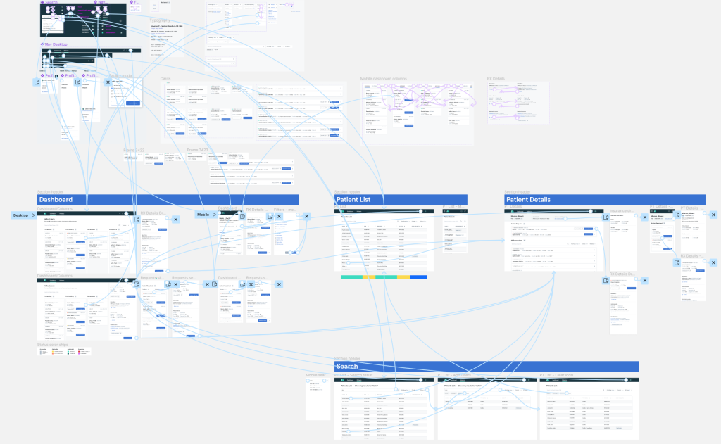
After several iterations of wireframing, exploration, and increasing the fidelity of my designs, I devised a list of the components and aspects which most required feedback. This included both designs which deviated significantly from the existing version as well as new workflows.
From that list, I created desktop and mobile interactive prototypes on Figma.
In-person testing
Over the course of 3 weeks I was able to conduct a total of 9 usability tests, with 3 being remote and 6 in person.
It was imperative for the mobile designs to undergo physical in-person testing due to the smaller features and text whose clarity and ease of use was yet unknown. Being able to observe doctors and office staff in their actual workplaces and at their stations was also extremely beneficial for understanding how M360 fit into the larger picture.
Research findings
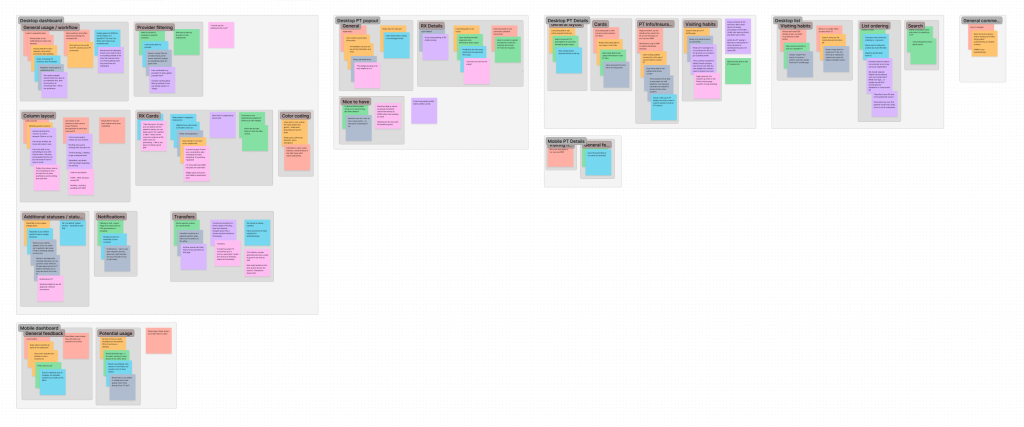
By comparing sentiments across different testing subjects, I determined several commonalities in themes and positive/negative reception.
Overall, users greatly preferred the streamlined prototype to the current version, citing the ability to view nearly all their prescriptions at a single glance. They also found that uploading prior authorization documents was much easier, though several expressed interest in receiving even more information about the status of prior authorization prescriptions.
Lastly, there were several key areas for improvement which I then revised in the high-fidelity version: larger clickable areas for mobile buttons and icons, and adding back in key columns for the prescription list
Final product
Card patterns
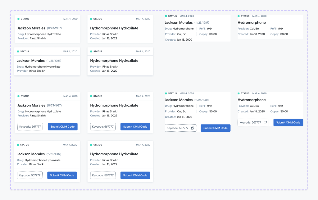
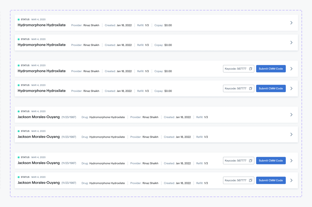
The card component is responsive and usable in compact versions on desktop or mobile, as well as in full length versions.
The information is divided into three sections; the largest primary data revolves around a single prescription or patient, with status and timestamp sitting discreetly above. If the prescription requires some action, a large CTA button sits below the primary section.
The ordering of these sections is easily stackable vertically or horizontally via CSS flexbox.
Convenient actions
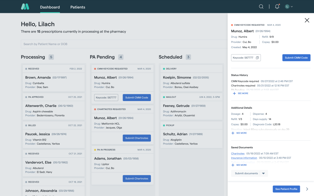
I wanted to bring prior authorization requests front and center to the experience while still providing a general overview of a provider’s prescriptions through Medly.
This was achieved in 2 ways: firstly by ensuring that CTA buttons are prominent and highly contrasted from the rest of the interface, and secondly by reconfiguring the notifications section.
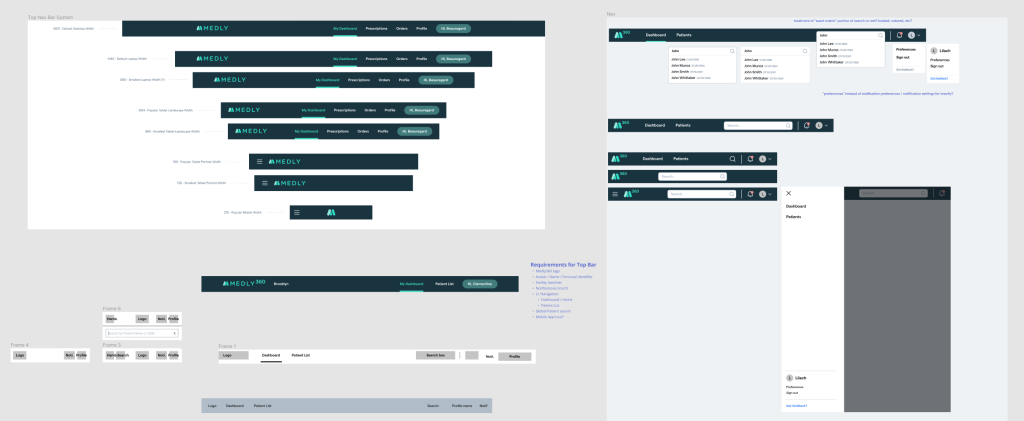
The notifications section is pervasive throughout the tab since it sits on the navigation bar, and includes both prescriptions with prior authorization outstanding requests as well as passive notifications about prescription status changes.

Wrapping up
Key takeaways
I learned so much by being able to participate and own parts of the research and testing process for this project, and it really highlighted the exact pain points of our users and gave me more concrete goals to work towards.
It was also very humbling to better understand just how busy healthcare providers are and how many fragmented pieces of information and software they need to juggle on a daily basis. If Medly 360 can save even just a small amount of their time and headache, that would validate my work immensely.
Future status
Development for Medly 360 has begun, however due to resource constraints and other ongoing projects within the company it is being paused at the moment.
I am hopeful that the care and work I put into this redesign will come to fruition and to our user’s computers, tablets, and phones sometime soon.
In the more distant future, I would love to rethink the data models around which our product is centered, and how they can be better portrayed or arranged so that seldom-sought information (such as the patient profile page) isn’t so prominent.
