Company
Drata Inc
Duration
4 months
Role
Product designer
Team
Self, PM, eng. manager, eng. team
Background
The user
Compliance managers prepare for audits by gathering evidence and maintaining its timeliness. Previously, everything was manually set up so users would upload each document or link piecemeal and then link it to a relevant compliance control. It was clear by collecting Productboard requests that users wanted more automation and less hassle, as the overall volume of requests resulted in a high ARR value.
The role
Having worked on previous evidence library enhancements, I had some familiarity with the feature. I generally understood the mechanics and different types of evidence managers were dealing with, but automated data from Drata tests was an area I had no experience in. I relied heavily on my fellow designers to get me up to speed on the basics of testing and monitoring before understanding how these fit into the evidence picture.
Data volume concerns
Right data, wrong place
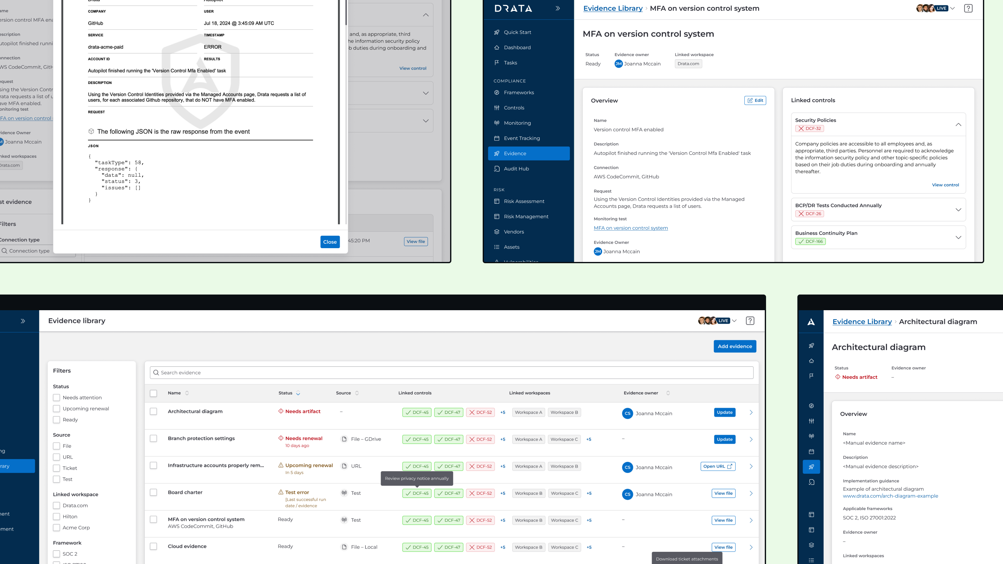
The data we wanted to integrate into the evidence library was not new, but rather existed in a different area of the application known as event logs. It was tedious to sift through because event logs also included many other types of application changes such as user assignment, editing, deletion, etc. When a user wanted to dig further into why a test failed, they would have to travel from the corresponding test and through several clicks in order to identify a specific test run and analyze its JSON output.
One test, many runs
Having worked on previous evidence library enhancements, I had some familiarity with the feature. I generally understood the mechanics and different types of evidence managers were dealing with, but automated data from Drata tests was an area I had no experience in. I relied heavily on my fellow designers to get me up to speed on the basics of testing and monitoring before understanding how these fit into the evidence picture.
Early issues
Miscalculated initial scope
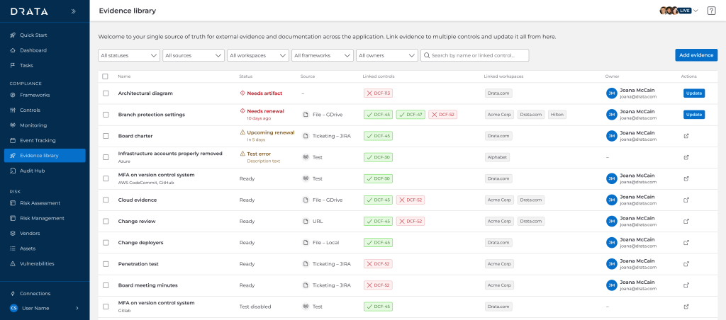
Because this proposal was introduced late in the quarter, it was intended as a quick project with little time allotted for research or design. At the onset, the thinking was to simply fit automated test data into the current page, so I tried to fit the existing evidence drawers. I ran a workshop with other designers working on similar componentry in order to come to a consensus, and overall it was navigable and fit well enough into the existing mental model.

Costs of retrofitting
At the same time this effort was underway, the organization as a whole was undergoing a shift towards using our new design system. It was still in development and not fully completed, but key components such as the font system, field inputs, and tables were already published. As part of keeping work minimal, I added the new automated tests to the current table, but the development team raised concerns the work would have to be scrapped and redone later.
Evidence guidance
Another factor we had to consider was the ongoing development of another evidence-related feature, evidence guidance. Though it was already defined and ready, it added another type of evidence with slightly different metadata and treatment for us to consider.
Pivoting
Rethinking mental models
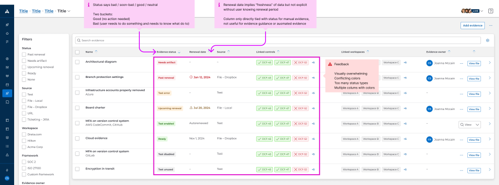
Due to the volume of test data, my PM and I really had to rethink how to organize automated evidence. Ultimately, we were able to conduct internal research with our compliance team and further identify that the two evidence types should be treated differently:
- Manual evidence: Users can and should manage them directly from the evidence library
- Automated evidence: Users want to keep these records, but prefer to act on them directly from the tests themselves
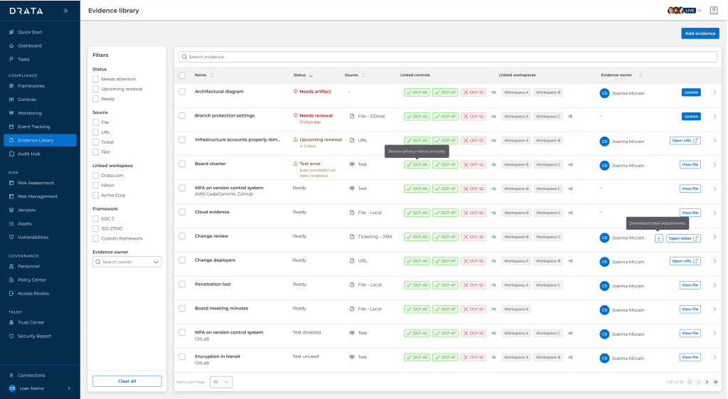
As a result of this, I was able to better categorize and prioritize the evidence table’s columns to account for both. We could not keep the old table which was solely centered around evidence when concepts such as renewal dates or requiring immediate attention don’t apply to automated data.
Embracing new components
After further sharing the costs and benefits of a faster release but putting off more work down the line, both the product and design team agreed it would be best to spend more time up-front investing in the new design system. There were still concerns about unpublished components or ones that had yet to be widely implemented like tables. It was only through a lot of effort and a lot of cross-team coordination that we were able to best use the new design system, but it was well worth it to push for a more standardized experience.
Final product
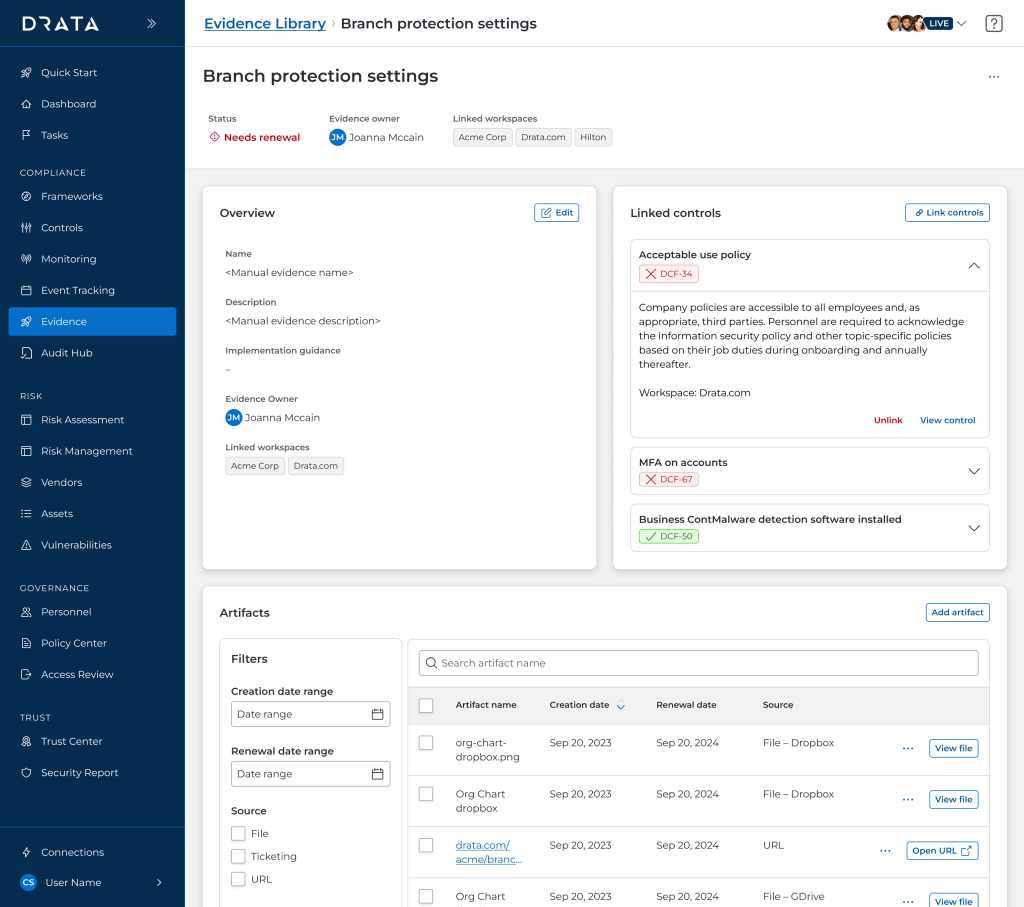
Refreshed detail pages
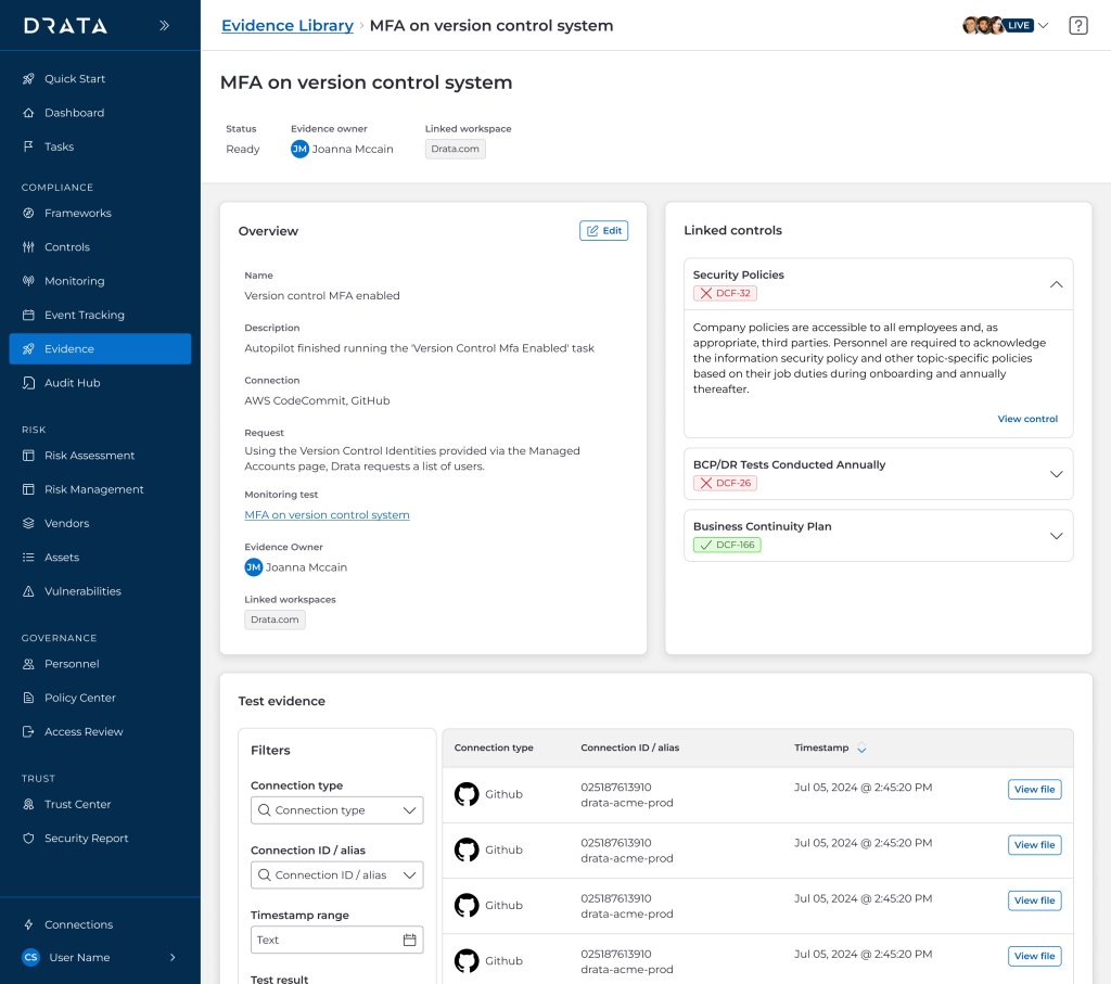
Technical limitations and the push for design system adoption presented the perfect opportunity to use the new detail page pattern. It was not as simple as transposing everything from a detail drawer to a page because I needed to explore tabs, cards, tables across the two types of evidence as well as in other ongoing designs. I deliberated a lot on nomenclature and what actions required instant access vs could be abstracted as secondary.
Tidier table
The general evidence library table itself was ported to the new design system as well, with a great focus on minimizing color to keep the visual focus on urgent and actionable items. I had to design several rounds of revision due to the newness of the component and the need for the design team to standardize table cell data as much as possible. Ultimately, the key point is that the status column is sorted by default and curated such that manual evidence will show up first, before the deluge of automated test evidence.
Wrapping up
Key takeaways
Advocating for reducing tech debt is also a huge win for reducing design debt. Previously, any small component change required auditing the app for a dozen minutely different iterations, because it was faster to build that way. But it was clear this led to more time spent designing all potential screens and states, as well as combing through QA. Spending more resources in the beginning of the project (or rather, as early as possible) would prevent months of cumulative patchwork down the road.
Future status
Another key to aligning my efforts with that of the rest of the design team’s so we could observe the entire user journey through the app. Especially since evidence is considered an end branch, it is important to consider the entry points and higher-touch areas (namely, the detail page itself rather than the table). By showing the end-to-end flow to our internal compliance team, they were better able to make sense of each granular page and tab in context rather than isolation.
